BA (Hons.) GRAPHIC DESIGN – END OF MODULE SELF-EVALUATION
Module Title: DESIGN FOR PRINT/COLOUR FOR PRINT
Level: 02 Semester: 02
1. What skills have you developed through this module and how effectively do you think you have applied them?
For me this module has been a huge eye opener. I have been working in programs that I have never used before, such as Adobe After Effects and iweb. Both I have found both enjoyable but iweb more so than After Effects. I particularly found After Effects challenging. Personally I don't feel animation is for me and working to try and achieve something I wasn't really interested in was frustrating at times. On the other hand I have learnt the basic skills in both programs and been able to produce something from nothing. The most important thing I learnt, which to some may be common sense, is to back up and BACK UP my work. Relying on a computer is a big no no and if you don't back up your work then you are bound to lose the majority of it! Being able to produce me illustrations in Illustrator and then import them into After Effects to animate them was the best skill i learnt. Having the satisfaction of seeing my own work move was quite exciting! And working with sound was a challenge too. This is something else I hadn't ever done before. Had I not been able to incorporate the skills I have to produce my illustrations in Illustrator I don't think my animation would have turned out anything like it did. Without producing my own illustrations I wouldn't have felt satisfied with the style it was in. I feel that the illustrations i produced in the end were fairly suitable for the brief. Stop frame animation would have been another option, but the not the route I wanted to take with this particular project.
2. What approaches to generating work and solutions to problems have you developed and how have they helped?
The majority of my problems was learning to keep all imported images or text in a file together with my After Effects project, as time and time again i saved my work but yet when I opened it I was finding lost links and the computer could place the file or find it on the machine. This was a constant shock and stress as each time I had to replace or find the file in question that had gone walk about. This took me a fair few times before i finally got it drummed into me! Other problems that occurred were from not backing up my work. Thankfully i didn't lose a great deal but by saving it all over the place and not just replying on one source helped my chances of not losing what i had literally spent hours trying to do.
3. What strengths can you identify in your work and how have/will you capitalise on these?
I have continued to try and develop my skills in illustration throughout this brief by working in Illustrator more. For example I produced all my illustrations by hand, scanned them into illustrator and then pen tooled them all. This was a process I had used with my illustrations before on a previous project and a way of working I have found to enjoy. By doing this I became a lot more confident in Illustrator and grasped a better understanding of layers and grouping. Once I had saved my illustrations in various layers it then allowed me to work with the separate layers and animate them separately from one another in After Effects. I would like to capitalise on this by continuing to keep this way of working and produce more work in a similar style to the illustrations used in this project. I feel that image making is currently my strength.
4. What weaknesses can you identify in your work and how could you exploit these more fully?
I'm not particularly a competent user of Adobe After Effects and feel that my skills could be improved on in this area. I also feel that I keep my colour pallet quite limited a lot of the time and could perhaps try and experiment a little more with colour. Carrying out more in depth research will help my projects no end and i feel this is a key are that needs to be exploited in the future in order for me to answer briefs accordingly. other than that i feel that reading into my subject area and practicing my skills both using a computer and not will help my practice in the future.
5. Identify five things that you will do different next time and what do you expect to gain from doing these?
1. Time management – Not leave things until the last minute and use my common sense to start things earlier.
2. Experiment further with illustrations in illustrator. Stroke, fills, tints etc.
3. Research better – Looking back it was limited. Primary or Secondary.
4. Consider rules when designing for on screen and take every precaution not to lose work.. BACK UP YOUR WORK! Never reply on technology.
5. Try new animation skills in After Effects and not just stick to basic rotations and what I already know - add a bit more complexity.
Friday, 13 February 2009
Wednesday, 11 February 2009
Vectorsoul.com
Check these guys out. This is their show reel for 2008. Containing a variety of animations done for some of their clients that year.
I was browsing through the rest of their site and noticed how they laid out their development showing the viewer exactly how they worked that particular project for the client. It goes from the very beginning through to the story boarding and onto the final product. Exactly the kind of journey I want to show on my iweb. Here is the final video they created and I also took some screen grabs of the back up work they showed.


I was browsing through the rest of their site and noticed how they laid out their development showing the viewer exactly how they worked that particular project for the client. It goes from the very beginning through to the story boarding and onto the final product. Exactly the kind of journey I want to show on my iweb. Here is the final video they created and I also took some screen grabs of the back up work they showed.


Tuesday, 10 February 2009
No-Domain
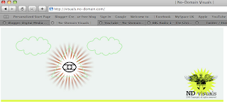
'Graphic design meets video art, video art meets illustration, illustration meets beer, beer meets animation, animation meets experimentation, experimentation meets a nation... but... which nation?'
http://visuals.no-domain.com/
These guys are ace. They collaborate with other artists to produce visuals used for all sorts of live productions such as film festivals and live dj sets. Unfortunately I couldn't get the videos to appear directly onto my blog but if you click on the links below they will take you directly to the videos.
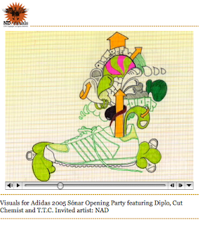
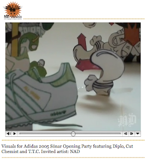
http://visuals.no-domain.com/html/adidas2005.html
This one is pretty amazing. The visuals snap so well in time to the audio, something I very much admire. Here are some screen grabs from it.
http://visuals.no-domain.com/html/lychee.html
http://visuals.no-domain.com/html/delasoul.html
http://visuals.no-domain.com/html/edan.html
http://visuals.no-domain.com/html/sonar2004.html
http://visuals.no-domain.com/html/uglyduckling.html
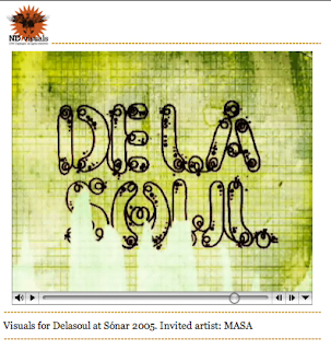
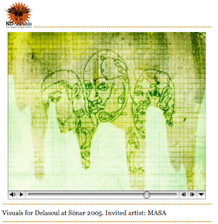
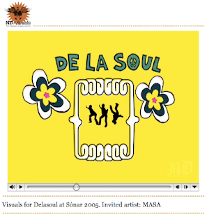
This is definately my favourite. No-domain have collaborated with an artist called MASA for this one who is a big inspiration of mine. i really like his work and style of working. Here are some screen grabs from the video...
E4 ending..
I'm pretty sure this is going to be the ending for my animation. I'd like it to work as an ad ident. I thought that the white strips appearing from behind the e4 symbol would be harder to animate than it was, so I'm reasonably pleased with the way it has come out.
The Final Product and thoughts..
Well at long last after many many attempts at producing my 30-50 second animation I think I've cracked it. I'm still not happy with it might I add, but I feel that this is one of those things where I could probably go on trying to tweak it here and there forever. Personally I'm quite self critical of it. For example the numbers 1-10 appear in random order dotted about, sometimes barely even noticeable, but I missed a couple out and didn't realise until it was too late! Though for anyone else watching it, it's not something they would pick up on - I hope. I drew all the illustrations myself and then vectored them in illustrator. This is something I'm very picky about. I don't feel I have created them to the best of my ability and I also feel that some illustrations are stronger than others. Perhaps this is something I could go back and try to work on in the future. I'm pleased with my limited colour pallet and feel that keeping the illustrations in just a black outline worked well. I tried to work as best I could with the audio. Again this was all new to me, so I don't think I managed too badly to say it was my first attempt. I don't think animation or working in After Effects is one of my strong areas within graphic design though, so I did find it rather challenging. However I did come away with a feeling of proudness having being able to produce something rather than nothing! I would have liked to have made it a little more complex and animated my illustrations a little more. However I felt that I needed to be realistic and I didn't want to over complicate it too much for myself when I was such a novice to using the After Effects software. It was very much trial and error - more error than trial in my case..
So here it is, the one and only.. Enjoy :)
Might I add... It took my 5 attempts to get this on here!!
So here it is, the one and only.. Enjoy :)
Might I add... It took my 5 attempts to get this on here!!
A slight progression!
We now have audio! Yes we do. Nearly finished :D
Ooh it's a novelty to have a bit of audio. I've yet to complete the order and duration of each but here is the rough outline so far.
Ooh it's a novelty to have a bit of audio. I've yet to complete the order and duration of each but here is the rough outline so far.
Thursday, 5 February 2009
Storyboards for iweb
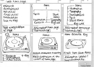
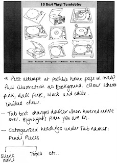
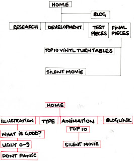
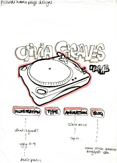
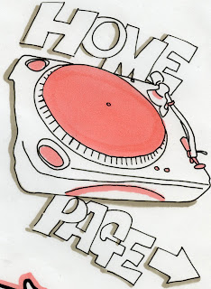
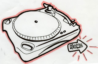
The following are similar to the storyboards I have produced to help me with my animation, however these are for my iweb. I am currently producing my own website in iweb and these are rough ideas of how the tabs and links might work. You can see from the pictures on early posts that I have also taken screen grabs to help reference and evaluate my progress.


Subscribe to:
Comments (Atom)
